> For the complete documentation index, see [llms.txt](https://docs.nickarce.com/llms.txt). Markdown versions of documentation pages are available by appending `.md` to page URLs; this page is available as [Markdown](https://docs.nickarce.com/bricks-mega-menu/docs/bricks-mega-menu-template/getting-started/dropdowns/menu-dropdowns.md).
# Menu Dropdowns
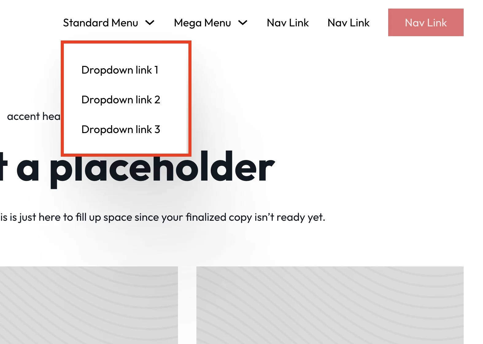
## Menu Dropdown Container Styling
***
For changing the styling of the menu dropdown container, update the @mixin standard-menu-dropdown-content.
```scss
@mixin standard-menu-dropdown-content {
//style here
min-width: fit-content;
box-shadow: 119px 360px 152px rgba(0, 0, 0, 0.01), 67px 203px 128px rgba(0, 0, 0, 0.05), 30px 90px 95px rgba(0, 0, 0, 0.09), 7px 23px 52px rgba(0, 0, 0, 0.1), 0px 0px 0px rgba(0, 0, 0, 0.1);
// link text length. this will help size the dropdown
> li a, > li .brx-submenu-toggle {
white-space: nowrap;
}
}
```
the below line of code is to target the links inside the menu dropdown to make sure they do not wrap onto new lines. You can adjust as needed
```scss
// link text length. this will help size the dropdown
> li a, > li .brx-submenu-toggle {
white-space: nowrap;
}
```
{% hint style="warning" %}
1. If you want to change the background of the dropdown container see the docs [here](https://docs.nickarce.com/mega-menu-template/getting-started/dropdowns#dropdown-background-color)
2. If you want to change the padding it will be from the internal link padding seen in the below step
{% endhint %}
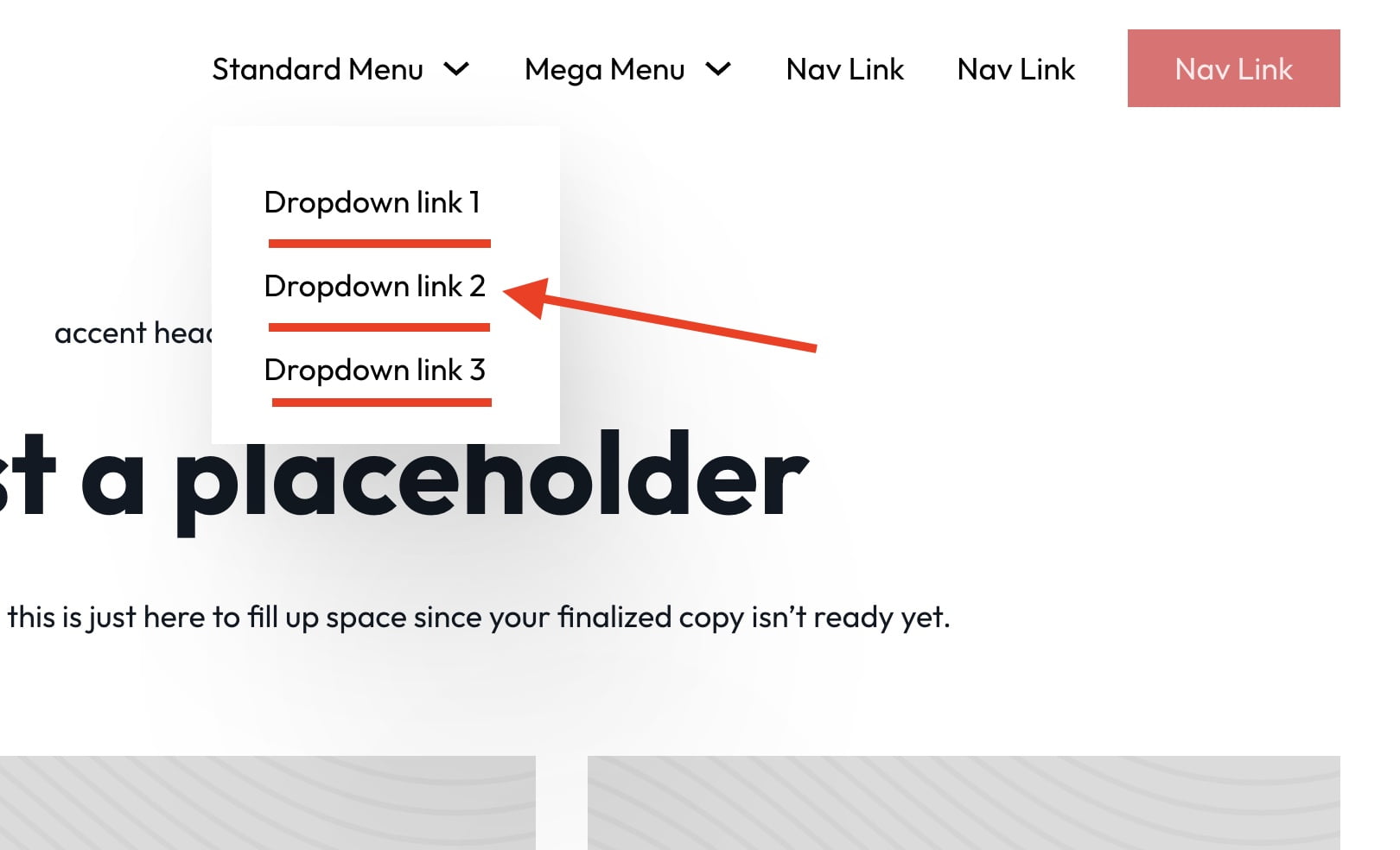
## Menu Dropdown Link Styling
***
To style the links within the menu dropdown we will find the @mixin dropdown-link-style. The padding on the links will alter the "padding" of the container as the container does not have padding.
```scss
@mixin dropdown-link-style {
color: black;
padding: 2rem 1.4rem;
//hover styling
&:hover {
color: white;
background-color: black;
}
}
```
## Adding Multi-Level Dropdowns (deprecated at V1.5.5)
***
Added with V1.5
Multi-level dropdowns will only work with a menu dropdown and not with a mega menu dropdown.
1. Find a menu dropdown and duplicate it within bricks
2. Drag the duplicate dropdown inside of another menu dropdown. The structure should look like this Menu Dropdown > Content > Menu Dropdown + Nav Link(s) \

3. WARNING: Do not turn on multi-level from within the dropdown itself as shown below. It will not work as expected.
4. Change the below value in the SCSS sheet to true to enable multi-level support. (deprecated as of 1.5.5)
```scss
//MULTILEVEL DROPDOWNS (will turn off some animations to function) ******
$multi-level-dropdown: false; // SELECTION (true/false)
```
## Creating Dropdowns from the Wordpress Menu System
If you want to use the default menu system that worpress gives you, you can now create individual dropdowns using the menu builder inside of wordpress. Here is a tutorial on how to do it:
{% embed url="" %}
---
# Agent Instructions
This documentation is published with GitBook. GitBook is the documentation platform designed so that both humans and AI agents can read, navigate, and reason over technical content effectively. Learn more at gitbook.com.
## Querying This Documentation
If you need additional information that is not directly available in this page, you can query the documentation dynamically by asking a question.
Perform an HTTP GET request on the current page URL with the `ask` query parameter, and the optional `goal` query parameter:
```
GET https://docs.nickarce.com/bricks-mega-menu/docs/bricks-mega-menu-template/getting-started/dropdowns/menu-dropdowns.md?ask=&goal=
```
`ask` is the immediate question: it should be specific, self-contained, and written in natural language.
`goal` is optional and describes the broader end goal you are ultimately trying to accomplish on behalf of the user. GitBook uses it to tailor the answer towards what is most useful for that goal.
The response will contain a direct answer to the question and relevant excerpts and sources from the documentation.
Use this mechanism when the answer is not explicitly present in the current page, you need clarification or additional context, or you want to retrieve related documentation sections.