Mobile
Mobile Breakpoint
Step 1: change out the SCSS variable seen below that is inside of your scss sheet to your desired mobile breakpoint
// WHEN WILL YOUR NAVIGATION CHANGE TO MOBILE? ******
$navigation-breakpoint: 1100px;Step 2: Change out JS Variable
// Mobile Breakpoint
const MENU_BREAKPOINT = 1100;Mobile Hamburger Icon
Size
Color
Icon

Mobile Close Icon
Size
Color
Icon

Mobile Menu Open/Close Animation
Slide Position
Transition
Mobile Background Color
Mobile Padding (dynamic)
Vertical Padding $mm-pad-v:
Horizontal Padding $mm-pad-h:
Mobile Link Styling
General styling
Link Dividers
Last Nav Item As a Button
On/Off
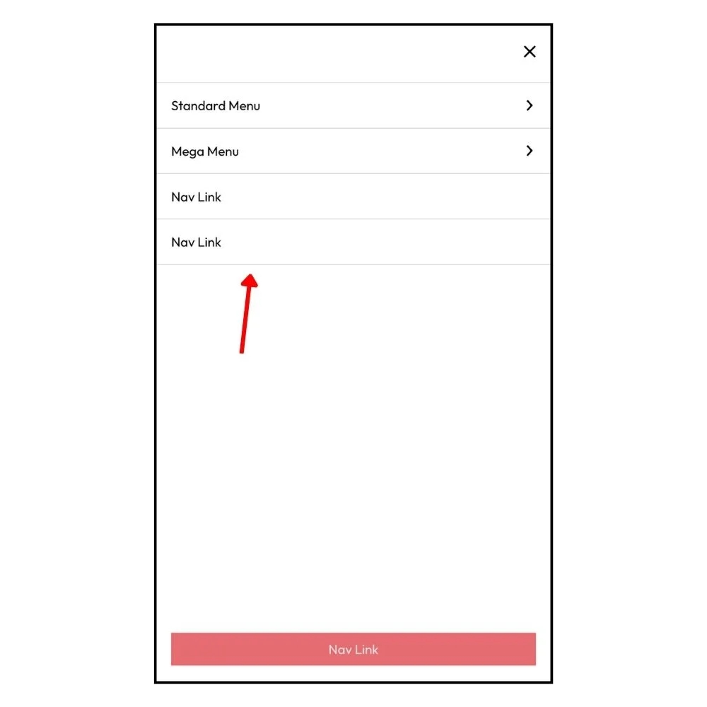
Push Last Link To Bottom Of Screen
Last updated