Menu Dropdowns
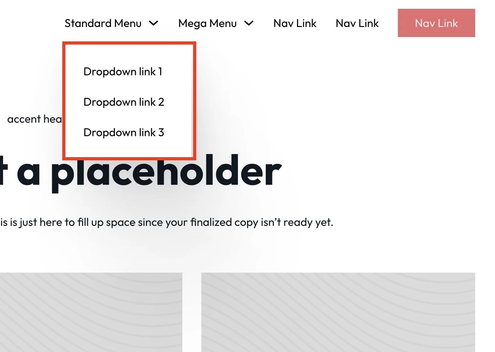
Menu Dropdown Container Styling
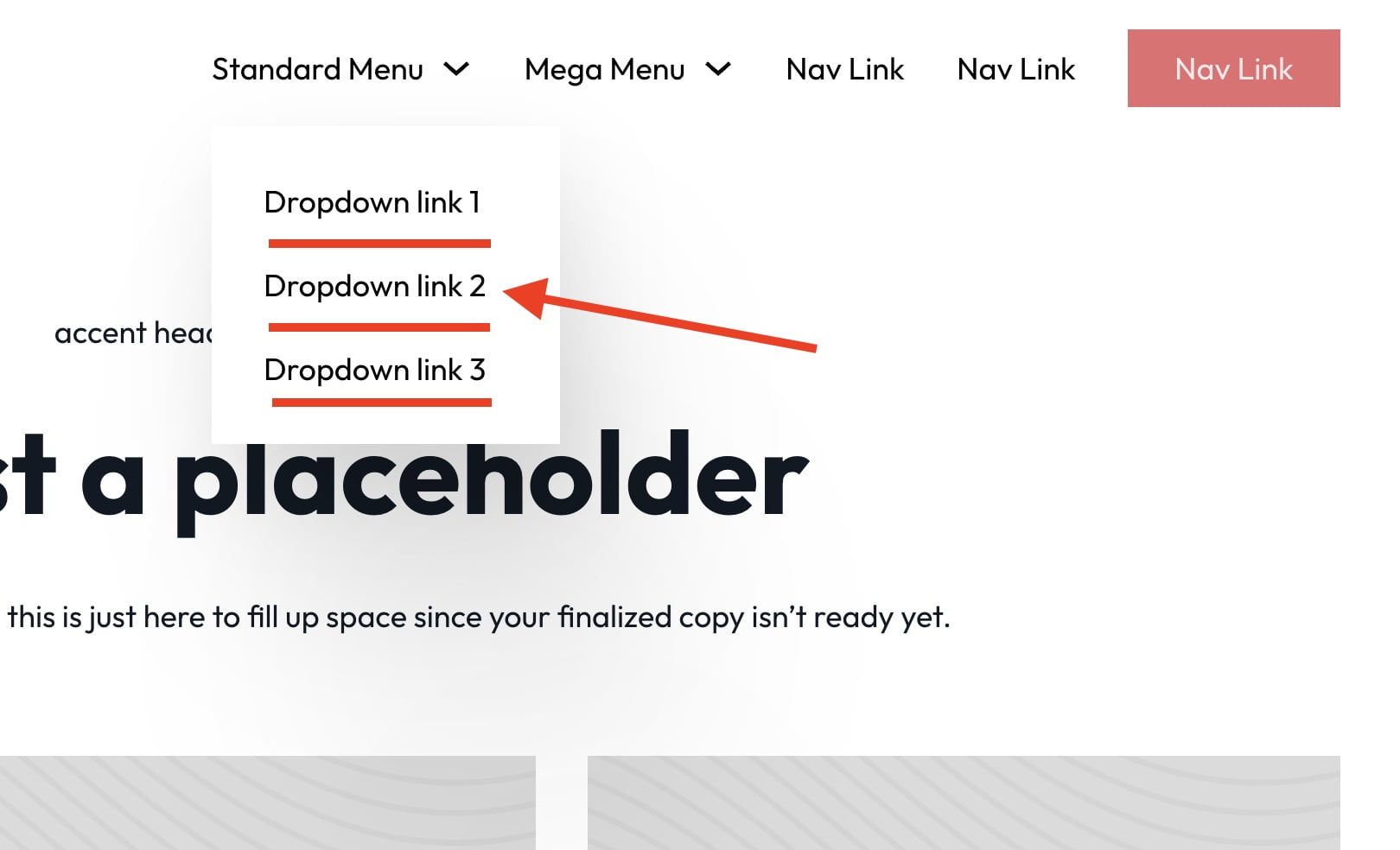
Menu Dropdown Link Styling
Adding Multi-Level Dropdowns (deprecated at V1.5.5)
Drag the duplicate dropdown inside of another menu dropdown. The structure should look like this Menu Dropdown > Content > Menu Dropdown + Nav Link(s)


Creating Dropdowns from the Wordpress Menu System
Last updated